Translate

Saturday, April 11, 2015

"Marriage is a Work of Art"

So what does the average person think of when they think of a married artist? Most of us think of stormy rivalries, deceptions, jealousy, a la Frida Kahlo and Diego Rivera. Or we think of one of the artists (usually the wife) putting away her brushes to raise the kids and do the taxes, so selfless, while her partner works tirelessly on his craft.

I know that when I was in art school back in the olden days, I was terribly allergic to the concept of dating, much less marrying, another artist. I was self-aware enough to know my competitiveness would ultimately thwart the relationship, plus, if you've gone to a classic art school (especially 20+ years back), the odds of getting hooked up with a self-absorbed prig was pretty high. No, a regular Joe was the only option for me, and I did in fact marry 20 years ago to, of all people, a boy from my high school crowd I bumped into while in college and reacquainted myself with. None of my artsy couple friends lasted more than a year or so, much less married.

So, can love and art survive together in wedded bliss? And if so, how?

I've met some lovely couples in the art world, and it apparently seemed that marriage can work, and in many ways, bolster the creative works of both people in the marriage. In talking with many of these couples, it occurred to me that this would make a really interesting exhibit. I invited seven couples and gave each of them free reign to use a wall space however they choose.

A few of these couples are barely out of newlywed status, such as Mark and Sara (nee Betsy) Winters and Justin and Annie Stegg Gerard. A few of them span decades, such as Norman and Tory Taber and Brian and Wendy Froud. But no matter how new or established the relationship, it's abundantly clear that something was worked out between them, and the result is very special.

Take Greg Spalenka and Roxana Villa, for example. This couple married later in life and although Roxana has an art background and can hold her own with illustration, she became enamored of the world of scents and perfume. Sensitive to chemicals, she strove to create all natural, unusual scents first for herself, then to sell as Illuminated Perfumes. Greg and Roxana worked together on her product, with him creating art for her packaging and marketing endeavors. The result is sensuous and reflective of her vision (and his as well). These two enjoy working together despite having very different directions in work (he is a graphic artist and workshop instructor with his Artist as Brand).
 #5 Bois, Banner image for Roxana Illuminated Perfumes, Greg Spalenka
 Vinod Rams and Emily Fiegenschuh tend to work differently on a daily basis, with him working in the video game business and Emily working from home on illustration projects. They met and bonded over drawing, and it's clear that this lively couple enjoy each others company. Although they seem to think their work is totally different, it's pretty easy to see they influence each other heavily in their work. Both enjoy working in gouache (which is a type of opaque watercolor) and one can guess these two probably sit up late at night together eating Emily's delicious brownies (she bakes) and chatting and laughing while painting away at their respective drafting tables.
Children of the Forest, gouache, Emily Fiegenschuh
The Green Man, gouache, Vinod Rams
Norman and Tory Taber have been working together on children's books for ages (see Rufus at Work), and both know how to collaborate together without killing each other. Norm works as an art instructor at SUNY Plattsburgh, and Tory works from home on her illustrations while raising their two daughters. Both of them work in separate studios, and Norm has been developing his assemblage work of found architectural objects as well as antiquated and quirky photography. Tory has stuck to the tradition of illustration, creating art for ballet and theater posters among other things. Despite having very different styles and modes of working, there is a very clear connection between the two, especially in the love of nature, the fairy realms and their children (which feature regularly in both their work).
Are You Still Cold?, Acrylic and gouache, Tory Taber
Cut the Clouds Full, Assemblage, Norman Taber
Omar and Sheila Rayyan have been together a very long time and have worked side by side supporting each other over the years. She's done the "regular job" thing (often artists have to have at least one of the two work a job to make ends meet while they work on their careers) while he's toiled away at his illustrations, creating an impressive body of work in the last few years. Sheila hasn't been too far behind, working in pencil illustrations but also creating lovely stoneware and pyrography pieces (a burning technique to create designs on wood) through her Mother Spoon Studio. They have very different styles of working, but both share a sense of humor in their work and relationship that no doubt keeps the creative fires burning.
Princess' New Pony, Oil, Omar Rayyan
Sun, Stoneware, Sheila Rayyan
Mark and Sara Winters are very recently married, but with Sara's old soul (she's 25 years old) and their clear respect for each other, it's like they've been together much much longer. When they work together at home, they often critique each other's work ("brutally honest" is how Sara puts it) and help each other stick to their deadlines, as both work in the game industry as illustrators. This is a very competitive industry and it's easy to get hung up on how many contracts one pulls in versus the other, but these two can hold their own and more importantly, they see the bigger picture.
Medusa, canvas print of oil painting, Mark Winters
Serra, Digital painting with gold leaf on canvas, Sara Winters
Justin Gerard and Annie Stegg Gerard are another newlywed couple, and easily the darlings in the imaginative realism circuit. Funny, bubbly, attractive and incredibly friendly, it's hard to not like this current Power Couple, as they both have been burning up the publication industry as of late, winning awards and accolades all over the continental US. But they keep it real: Annie just wants to raise chickens in the backyard of their Georgia home, and both love painting together. Iconic and mythic imagery arises from their brushes and pencils: Justin's work has a strong nod to classic illustration, while Annie is clearly following the path of the PreRaphaelite. I have a feeling this relationship has a long, successful road: they simply adore each other.
Limnaee of the Lake, Oil, Annie Stegg Gerard
The Last of His Kind, Oil, Justin Gerard
And finally, we have Brian and Wendy Froud, married 35 years and counting. They met while "The Dark Crystal" was in production (she worked for Jim Henson, he was the concept designer for the movie). Both collaborated for "Labyrinth" (including using their own baby Toby for "baby Toby" in the movie) and she's popped up as his fairy model from time to time over the years. While they both have very clear, defined styles (she's stayed true to her sculptural roots, and he continues to draw and paint the fairy world) they have collaborated together many times, producing several books together. Brian has his head in the clouds and Wendy has her feet planted in the ground, making for a balance that has fueled their relationship all these years.
Kneeling Faery, Watercolor, pencil, color pencil, Brian Froud
Faery Woman, Mixed media polymer clay, Wendy Froud
So okay, you can have it all: a career in the arts and a partner to share it with who understands your passion and drive without it blowing up all over the place. Things don't need to smash, mad screaming doesn't need to occur, and nobody needs to be left behind in the dust. Kids can be raised successfully, families are fed and shod, and you can even have egg laying chickens (if your husband agrees to it). These couples prove that marriage really is a work of art and love can mold and enhance each person to reach his or her greatest potential. I'm definitely sold, and I think anyone visiting this exhibit will surely agree.

"Marriage is a Work of Art" will open April 11th and runs through May 2nd. Online catalog goes live April 12th.

~Julie Baroh, April 2015

Wednesday, April 1, 2015

Ten Questions for Tim Bruckner

Ahh, Tim Bruckner. He snuck up on me like a Seinfeld sideler, sending me an innocuous email a few years back saying he was a sculptor and was hoping I'd check out his work. I get a lot of emails like this, so of course I took a big swig of bad coffee and dug in for another 5 minutes of art perusing I knew would never get back, I clicked the link to his URL and...

...queue the angelic choir.

Uh, this wasn't a pimply 14 year old sending me off to his deviantart account full of misshapen ashtrays from  ceramics class. This was THE Tim Bruckner, the guy that was so masterful a sculptor that his work "looks unreal, like a machine made it," as one of my visitors remarked. His work is seen on the set of The Big Bang Theory, it's in the Smithsonian, and most importantly, his work takes us back to a time when quality art in the public eye was about as American as, uh, pie. Humor, ruggedness, femininity, mystery, it's all there in a Bruckner piece, flawless, perfect.
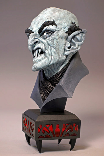
Nosferatu
So I was a little surprised, to say the least. From that email, the Masters of Sculpture show from 2013 was devised to expose Seattle to masterful work so very few of us get to see. Since then, we've taken Tim on board to represent as our newest Krab Jabber. As part of the rites of passage, I've asked Tim ten questions, and without further ado, this is Tim in his own words.

1. What brought you into sculpting? Were you always a sculptor?

I started sculpting when I was seven. I don’t know why. When I was a kid they had these wax tubes filled with a colored liquid so sweet you could go into insulin shock. One afternoon, after finishing a few tubes, I started sculpting the wax into the heads of a couple of the Seven Dwarves.  I thought they were perfect. In hindsight, they probably looked more like somebody’s thumb than Grumpy or Doc. But something clicked that day. I persuaded my mom to take me to buy some clay. And they rest, as they say, is stuff that happened.

2. Do you have a sculptor you admire (both currently and in the past)? How have they inspired your work?

When I was growing up my sculpting heroes were a bunch of old dead guys:  Michelangelo, Bernini, Cellini, St. Gaudens, Gilbert. Nobody in my family was into art. I didn’t know anyone who was. I stumbled upon pix of their work and didn’t get how they did what they did, but I did have a sense of why they did what they did. I was oddly attuned to compositional story telling. So, they inspired me to improve my technical skills to become a better story teller. Its something I’m still working on.  As far as sculptors working today? There are some amazingly talented sculptors. It’s a long list. Many are, I’m lucky to say, my friends. They inspire me daily. First, there’s that little pinch of envy. And then, you feel the challenge. Its not competitive. Its creative curiosity. Why did they make the choices they made. How did they make it happen. And it gets you thinking about your own process, both from a design viewpoint and an execution viewpoint. And ain’t that what art is? Trying to translate the unknown.

3. What was your favorite piece of yours and why?

I have favorites for different reasons. Mostly, I like pieces that worked in spite of myself. Pieces where I was smart enough to get out of my own way and let the piece decide where it wanted to go. That’s not an easy thing to do. With any artist who appreciates the power of technique, its hard to not play into it. When you know what it is you want to say, it’s important  to not oversell it with an artistic sleight of hand. Currently, I like, Belle et la Bete, SHE, He Who Laughs Last, ONE, Something to Consider, Eve Decides and IMAGINE. In a couple of months, the list will change.
Imagine, showing it illuminated from the inside
4. How do you start your sculptures? Do you do drawings first?

With personal work, I very, very rarely do any prep work. As a hands-for-hire sculptor for over forty-six years, working from 2D feels a lot like a job. I have an armature, some clay and some free time. And whatever happens, happens. Like I said earlier, the trick is not to get in the way. But with a piece like I am the Walrus, its such a complex piece, with so many elements, I needed a guide or sorts. And even with the design, I’m discovering things I could not have anticipated in its execution. But Walrus in an exception.
I Am the Walrus, work in progress
5. Has your industry changed a lot since you started? How so? Is it easier/harder?

The industry is significantly different. I’d been a professional for twenty years before I got my first sculpting credit. That meant I had the opportunity to get better. I got to learn. I got to learn how to be a better sculptor and learn what it meant to be a professional. 

Both of those opportunities are almost not available. These days, good, bad or adequate, you get credit. And it follows you. That’s not always a good thing. And there’s almost no place where you get to learn what it is to be a professional. How to understand what the job is and do the job. 

When I started, you either made your own molds, cast your own resins, produced your own paint masters, or you passed it off to someone else, to accommodate some else’s schedule. If I have a three week deadline and I have to budget my time getting my stuff to a mold maker, a caster and a painter, I’ve lost a week, at least, and a week I could be sculpting. The more time with the piece, the chances are you get a better piece. When you do it all yourself, you have total control. Client likes your work, it all on you. If they don’t, the same. You deliver what you mean to deliver, not what someone else thinks you mean. And, all the service costs go into your pocket. But most importantly, when you know each step, all the way to finish, and you understand what you can and can’t do, you are much more likely to produce work that pushes the boundaries of what is possible. 

And that makes you a better designer and a better engineer.

The biggest change, of course, is digital modeling. Almost every major gift, toy or collectible company relies more and more on digital modeling. From their perspective, it’s more efficient. And maybe in some instances, it is. But it’s shifted the production of product from a collaboration between the sculptor and their AD, to solely the discretion and direction of the product manager. And a good many PM’s, have almost no actual 3D experience. And, from my perceptive, the best 3D work is created by someone who knows what works in real space, under real lighting conditions, in a real environment. 
Something to Consider
There is no substitute for creating a physical reality in a physical reality.

Easier/harder? Depends on who you are, where you are in your career and what you want out of it. 

6. If there was one thing you could tell your younger self, what would it be?

Anything I would have told myself wouldn’t or couldn’t apply. You took every job you could. Ever sculpt a one legged pirate kitten?  You bet!  I’m looking for someone to sculpt a set a chimpanzee Siamese twins. Interesting, I did that this morning. By the time I hit my thirties I’d sculpted perfume bottles, puppet heads, a life size alligator suit, action figures, comic heroes, I’d done album covers, editorial illustration,  written, recorded and produced three children’s albums, produced limited edition bronzes and had worked for virtually every major gift, collectible and toy company in America. And none of that could happen today. I guess, if I could tell my younger self anything it would be, take a moment to pull your head out of your ass and have a look at the bigger picture. But when I came up, there was no bigger picture. You were lucky to connect the dots.
Afternoon Delight
7. So many folks don't seem to know how to display or live with sculpture. Do you have thoughts on that?

Displaying sculpture is different than hanging something on the wall. With something 2D, you find a place, drive in a nail, hang the sucker, and there it is. And the longer it is where it is, the less you see it. It becomes like a lamp or a wall clock. Rarely do lighting conditions affect it. But with something 3D, it has to occupy a different physical space. Its on a table, or a shelf, a mantle or in a display case. The changes of light during the day, and night lighting alters its character. Even the shadow it casts can change our perception of it. But just like something 2D, we stop really seeing it after a time. It becomes part of our décor. I strongly urge people to move their 3D stuff around.  Move it off the shelf in the den into the bedroom or the kitchen. Take it out of the display unit and put it on top of the TV cabinet or the mantle and see how changing its place in your day to day, changes your relationship to it. A sculpture seen in morning light will change character at dusk. 
DC Wonder Woman, based on a Brian Bolland design
8. What is the next step in your career? You are semi-retired, so you must be up to something!

One of the things that being off deadline has given me is the ability is to think things through. When I was pulling a full free-lance schedule, I like most free lancers, sandwiched personal work in between deadlines. You got done what you had time to get done. Its not that you didn’t have time to think about it, you just didn’t have time to change your mind. Now that I have the time, I’m surprised at how my work has been able to evolve. The first piece I experienced that with was SHE. I started off thinking one thing, and the more I thought about it, the more it evolved and, I think, for the better. 

Same with Eve Decides, most certainly with I am the Walrus. I think that’s the biggest difference, the chance to change my mind to make something better.

9. Do you have a favorite hobby outside of your work?

I write. I’ve always written. I became a little more serious about it when I started writing Christmas stories. When our kids were young, I’d write a Christmas story with them in it and read it to them over the Holidays.  As they got older, and were less inclined to listen to their old man drone on, I started expanding. Over the past twenty or so years I’ve written Christmas themed stories that have run the gambit from hardboiled detective to Renaissance mystery. Then I got kind of more serious. I had my first book of fiction, Sensible Redhorn, published by Pro Se in 2013. And my second, The Adventure of the Pearl le Fong, published last year. I have another ready to go this year with Pro Se and several ready to be published through Airship 27.  I enjoy the hell out of writing. And the same thing holds true with writing as it does for sculpture, my job is to just stay out of the way. I’m just here to take notes. Oh, and I like feeding the birds. And they like me doing it.

10. Is there any advice you would give to an artist interested in sculpting?

Focus. There is so much more competition these days. You might be a multi-dimensional talent but Art Directors are looking for someone to do a specific job. When you show your portfolio and it’s got everything from super heroes to baby gorillas, its difficult for them to see what it is you do. So, starting off, pick something you like doing and are good at doing. Once you start getting work you can reveal more of who you are. Starting out, variety confuses people. Your AD and your audience are more comfortable putting you in a box. Once they know and understand you and your work, the box can get bigger and can have other boxes inside it. 

There are so many different ways to apply your talent, don’t get stuck thinking your future is in doing action figures or art dolls. Be open to any opportunity that presents itself. You never know where things might lead. A variety of professional experiences can only make you better.

Learn the business of art. It’s a business and you need to know how it works.

Hit your deadline. If you don’t there’s someone just as good as you are who will. Don’t take front money until you’ve done something for it. I’ve known too many artists who have taken front money for a bunch of jobs only to be squeezed by due dates and nothing to show for it. When you get screwed, and you will, move on. Learn how it happened and why it happened and don’t’ let it happen again. 

Most of all, be kind and supportive. And be generous. When you give freely and openly of your time and experience its makes for better artists and better art. And isn’t that something we all want?
A Little Mischief
___

Tim's work is featured regularly on his own Krab Jab page, as well as one of the featured artists in our May 2015 show, entitled Lennon, opening May 9th (Tim will be there!).

Sunday, March 22, 2015

FAERIE III: The Annual Exhibit of the Fae

I kind of hate the word "fairy".

It's true. I wince when I say it, even after all these years, I can't say it with a perfectly straight face. It's not the subject I detest, of course. It's the connotations that it drums up for me (and many others): Tinkerbell (Disney version), crazy old ladies who claim to see them in the potted plants on the kitchen window, pink tulle, prancing, and worst of all... really, really bad art. And lots of it.

I always feel like I have to defend myself when I say, "I make fairy art." People scrunch up their noses and say, "Oh, really?" in such a way that I might have well just said "I finger paint glitter while barefoot in the moonlight while the invisible little folk that live in my sofa do a happy jig on the ceiling." It's like all my years in art school just flushed down the toilet, my IQ just dropped 40 points and I probably can't draw anatomy to save my life. It's okay to say "children's illustration", "Rackham-esque art" or just "fairytale art", but fairy art just has a really bad rap with the general public. And fairy artists, even worse.

I know that fairy art isn't the dribble most people think it is; this was the impetus for FAERIE three years ago. With the help of local illustrator and workshop developer Tara Larsen Chang, we pulled together many of the most notable fairy artists of our current time, people like Amy Brown, Stephanie Pui-Mun Law, Gary Lippincott and of course, Brian Froud. We also introduced up and comers such as Yoann Lossel, Emily Fiegenschuh and Heather Hudson to the mix. It was a huge success, with artwork more sophisticated than cute, some of it dark and mysterious, but more importantly, very well done.
Forgotten Gods, Yoann Lossel, from FAERIE I
Now in it's third iteration, Tara continues to cast her net to collect artists both familiar and unorthodox. She invited a few regulars (such as the entire Froud family) as well as a few fresh faces, like Darlene Nelson, who works with found natural objects acquired from the desert. She also invited a few artists that have been dying to dip their hands in fairy ink, such as fantasy illustrator Mark Winters, who paused his normal schedule of digital illustration to create an original oil painting.
Wizzard, Darlene Nelson
The Hidden, Mark Winters
Darlene's piece definitely took the Whimsy Award for this show, followed closely by Omar Rayyan's Beetle Battle, Sheila Rayyan's Owl and Cat Faerie spoons, and the Frouds - Wendy, Toby, and Brian - with their respective entries. Christina Hess's Selkie Pup is probably the cutest piece in the show, but don't be fooled by the "cute" label, she is damned good at painting, and her intense fan following can easily back that up. She's actually the balance this show needs, as many of the pieces are as dark and melancholic as the eastern seaboard this last winter.
Beetle Battle, Omar Rayyan
Selkie Pup, Christina Hess
There are some strange similarities with the art this year. For example, some of the portraits look as if they belong together, such as Cory Godbey and Renae Taylor's drawings. Some were actually intended to work together: newlywed artists Justin Gerard and Annie Stegg-Gerard created a Faun and Dryad series of very tiny paintings in antique frames.
Portrait of a Young Faerie Girl, Renae Taylor
Elder, Cory Godbey
Ptelea, Annie Stegg-Gerard
The Faun of Ptelea, Justin Gerard


Blue skinned elven woman dominated many canvases, which was a little interesting since I don't think any of those artists actually saw each other's work prior to the show (with the exception of Sara and Mark Winters). Lindsey Look and Paul Tobin literally live a world apart, yet their fairies were similar enough to make the viewer take notice.
Specimen #406, Lindsey Look
Dryad, Paul Tobin
Blue Fairy, Marc Scheff
We had a few nods to A Midsummer Night's Dream (both Tory Taber and Thomas Dodd depicted the fairy queen Titiana). Night scenes were popping up this year too, which included Amy Brown's sudden departure from her striped-socked fairies, and Karla Ortiz' fairy and frog vignette.
Midsummer Dreaming, Tory Taber
Night Sounds, Amy Brown
With over 30 pieces of art, this show could have been a cacophony of styles and visions, but instead we see the world of the Fae in rich tones, hues, textures woven together like a beautiful shawl. The artists are clearly masters of their domains, but all of them allow the fairies to rise up from their chosen mediums and claim the minds of those who behold them. I can't stress enough of the importance of seeing this work in person: digital or printed reproductions absolutely pale in comparison to the real thing. For someone like me, seeing watercolorists Omar Rayyan, Stephanie Pui-Mun Law and Paul Bonner lined up in a row is an exercise in amazement. All three have their own distinct ways of painting, one can hardly believe it's the same kind of paint in each instance.

Incidentally, Wylie Beckert's formula for painting MUST be cracked: her painting doesn't even look real - and yet, it is. Could you guess that this piece is a 24 x 30" mixed media oil painting?
Fairy Brew, Wylie Beckert
But the art geek in me digresses... let me put my pointy FAERIE hat back on and say that once again, Tara has knocked it out of the ballpark with this collection, making the statement "I make fairy art" no longer an artistic faux pas but a clear stamp of respect, at least in the world of imaginative realism and fantasy. No longer the flaky, ditsy little sister genre to the fantasy world, fairy art is all grown up, sophisticated and mysterious, gentle to those she loves and unmerciful to those she disdains.

I absolutely insist you look over the Catalog (only available until the show ends April 4th), read the wonderful statements, and if you are in Seattle this month, make your way down to see the FAERIE's live, before the flit away for another year.

~Julie Baroh, March 2015

Sunday, January 18, 2015

Yvette Endrijautzki Presents: Divine and Sacred

I met assemblage artist Yvette Endrijautzki (en-dreh-yowt-skee) in 2009, when she had a show at the Georgetown Art Center, where my studio was located at the time. She was shy and quiet, with long dreads and a post-Apocalyptic way of dress that wasn't quite punk, not quite street, not totally steam punk, but something in-between. Her work had elements of paper collage and flea market assemblage with messages about the social ills of this world woven throughout them. Despite tackling heavy themes (alcoholism, drug abuse), they were sweetly charming.

High Priestess, Yvette Endrijautzki
Five years later, the dreads are gone, the shyness has melted away and the work has come into itself with a sharp, resounding clang. Shadow boxes and collage work is gone, replaced with organically composed assemblages of toys, junk, taxidermy and everyday items bound together. The assemblages are then painted in patinas of verdigris and bronzes infused with dirt and sand. The themes are esoteric and universal, allowing the viewer to develop their own responses to what they see.
Perception, Yvette Endrijautzki
Yvette had a tough year with health issues plaguing her, making it virtually impossible to work on her craft for months at a time. I was worried that having her headline a show would send her over the edge, but she assured me she could pull through, despite the backlog. She dutifully picked a theme for her show, being things "divine and sacred", a theme that does not stray far from her personal mantra to living.
Demeter, Yvette Endrijautzki
Yvette delivered 12 pieces, many of them only days old, to Krab Jab Studio literally 24 hours before we held the opening reception. These pieces were infused with myth and a touch of melancholy. Nothing is random; each little object has it's purpose and place, a part of a narrative that we can only half-understand. Her work is sophisticated, dark, and sometimes humorous, but never hopeless or bleak. You can sense she has a deep connection to the spirit world; her inner ears are open and receptive.
detail, Awake from the Abysmal, Yvette Endrijautzki
For this show, Yvette chose four artists to support her: Seattle's Joe Vollan and Elijah Evenson, midwestern Drew Tucker, and Japanese artist Tokyo Jesus. Each brought their own vision to the table: Drew's work quietly deals with the very recent death of his father, and Joe's paintings also articulate the passage through death, but in an Americana vein. Elijah's large sculpture was inspired by his dream world, one that he literally melds with, and Tokyo Jesus' dark erotica emotes a love for the human figure in life and death, albeit starkly. Whether accessible or not, each artist conveyed their  own personal vision to what is Divine and Sacred to themselves and, ultimately, to the viewer.
the Resurrection of the Garuda, mixed media sculpture, Elijah Evenson
Nov 18, Oil on pressboard, Drew Tucker
Bleed, mixed media, Tokyo Jesus
We adorned musical instruments with our dead so they would live on forever in our songs, acrylic on wood, Joe Vollan
It's clear that Yvette, though physically and emotionally spent with the work she completed  for this show, is bound for a future far greater than even I can imagine for her. She always lands on her feet, with her assemblages growing far more sophisticated and wondrous with every challenge she faces. She never ceases to amaze me. Sure, I'm biased: if you knew her, you'd be too. But her work can stand on it's own and speak a million words in the stillness that surrounds it. And that is truly divine.

This show will be on display through February 6th, with a closing reception from 6 - 9 pm.

~Julie Baroh, January 2015

Thursday, December 18, 2014

Ten Questions for Benjamin A Vierling

Back in the winter of 2013, my guest curator, Yvette Endrijautzki, informed me that she wanted to squeeze yet another artist into our "Chamber of Wonders" show, which was now mounting into a massive group show consisting of over 56 pieces by 40+ artists. I started to protest - this show was starting to become a cataloging nightmare - but she insisted this artist had something special to bring to the table. She then showed me the painting entitled Papaver Somniferum, and I readily agreed with her.
Papaver Somniferum
I think what immediately struck me with Benjamin's work was the pure chroma from his primary colors, which was very reminiscent of early tempera paintings I had seen in Florence and Vienna. Tempera is a paint with a binder of egg whites: it dries very fast and leaves behind very deep coloring rarely seen by other binders. Used by early European painters prior to the discovery of oil mediums, the colors were very intense and vibrant.
The Annunciation, a 15th C tempera painting by Fra Angelico of Florence
Benjamin works in tempera, oil, inks and polymer pigment, creating pieces of art that immediately transport you back in time, although his content isn't always archaic. He uses a form of the momento mori (or still life) in nearly all his pieces, freezing his subjects in a place within time, giving the viewer a moment to observe, with relative leisure, every finite detail he has chosen to render. His lighting is stark and artificial, enhancing that sense of timelessness.

Since I first saw his work last year, I have since followed up on this remarkable painter and have happily represented his work. Since he is not local to Seattle, I only saw it fit to ask him to answer Ten Questions so our visitors and collectors can learn a little bit more about Benjamin. Here's what he had to say!


1. Please give a little information on your background: what school did you attend, your inspirations for the direction you've gone, if and where you've taught.

My schooling has come primarily from individuals, books, museums, apprenticeship scenarios, and otherwise unique circumstances. I was always enamored of the Old Masters, and had the good fortune to grow up in an environment where I could immerse myself in tomes featuring Rembrandt, Goya, and Dürer. Living in proximity to the San Francisco Bay Area also facilitated contact with cultural and artistic experiences that illuminated my understanding of aesthetics in general.

 As a youth I studied for a few years with a painter in rural northern California who taught me the rudimentary fundamentals of oil painting. She was essentially a fauvist who crafted enormous, colorful canvases of an expressionistic nature, but she had a solid understanding of classical techniques, and imparted these principles to me. Her philosophy, which I agree with to this day, was that a  painter should know how to render form, color, and light with some accuracy, regardless of the stylistic direction ultimately taken.

The value of studying the great paintings in the world's museums should not be underestimated, and a large part of my understanding of composition and rendering has come from simply viewing and contemplating the great works. Visiting regional art museums is always a priority when I travel, and decades of wandering has enabled me to see some exceptional masterpieces in person. The modern era is unique in that so many unique treasures from all times are available for us to study and reflect on. Even small local museums often house gems to inspire and enchant. There is an anonymous victorian Madonna hanging in the foyer of the cultural center where I have my studio for instance, and her consolatory gaze still captivates me every time I pass through. 
Fantastical Aviary
I don't have a lot of experience teaching, although I have lectured at the Gage Academy of Art in Seattle, and co-facilitate a life drawing group in the northern California town where I live. While I have spent a lot of time studying & painting, my own methods of creation are ultimately somewhat erratic and intuitive, making literal transcription a challenge. My strengths as a guide through the creative labyrinth lie more in conceptual theories surrounding aesthetics in general, and in exploring the repetition of archetypal motifs throughout the history of Art. 


2. Explain your method of painting, especially with tempera. Did you develop this method on your own, or learn it?

I studied the traditional 'Misch' technique with Professor Rubinov Jacobson in the Austrian Alps. Jacobson is the foremost pupil of the renown Fantastical Realist, Ernst Fuchs, and he teaches the mixed media technique of working with egg tempera and oil on panel, in the manner employed by painters of the early renaissance. The method involves extensive use of subtle oil glazes over a monochrome tempera underpainting, and typically requires some months to bring to completion. When utilized correctly, the process evokes unrivaled effects of light and shadow, emboldens colors, and enriches the illusory nuances of dimensional space.
Firebird
I've experimented with the particulars of the technique, but more or less employ it as it was taught to me. It's a chemically delicate procedure, as the water based egg tempera must be carefully layered with the oil based glazes in order to prevent cracking and melting. The fundamental  principles can be applied to other media of course, and my process tends to involve a gradual building of forms through layering effects, even when employing polymer pigments or inks. I do a lot of work with ink and gouache on toned paper, and this style also reflects the aesthetic of the renaissance and early baroque periods which so fascinate me.

3. Your imagery hearkens to a period of late Medieval/early Renaissance symbolic work, especially of the Italian, Dutch and Flemish style. What is the draw to this type of symbolism in your compositions?

It's interesting to reflect on the Proteus that kindles the flames of devotion, compelling one to embark on a specific path. I could certainly cite numerous occasions when I was deeply moved by a particular work, or found myself confronted with an aesthetic experience that reinforced these inclinations. Traveling in Europe, spending time immersed in archaic books and staring for hours at the works of the great masters in cavernous museums has undoubtedly validated my field of interest, but it's often the quietly intimate notes that speak with the most resonance.

I remember that as a boy, my father has a large framed lithograph of Pieter Bruegel's painting, The Hunters in the Snow, hanging in his San Francisco flat. Whenever I visited him there, I would sleep under that image and watch the scene darken as twilight settled over the city outside, and then witness it come to life again when the dawn expanded into day. I marveled at the vision of these struggling, umber hued figures, plodding grimly through layers of ice towards the village in the valley below, all framed by the dark clutching limbs of naked oaks. The remote figures bustling in activity appear as myriad as insects, imparting a perspective of remote detachment which is then confronted with the looming imposition of distant mountain peaks, regal and unyielding. One is both humbled and calmed by the spectacle.
The Hunters in the Snow, Pieter Bruegel
Years later as a young adult, I was confronted with the original painting on my first visit to the Kunsthistoriches Museum in Vienna. I didn't realize that the work was there, and the discovery had a shocking effect. It was not unlike the disorienting experience of waking from a dream to find one's self within that very dream, the reality ultimately being richer, more complex, and more sensually overbearing than one could imagine. I spent some hours in that chamber with this work and all the other Bruegel paintings. They are all remarkable images of course, but years of accumulated memories converged in that one epic vision of the Hunters in the Snow.

To extract greater significance from this anecdotal reflection: It has always been my ambition to create something in which others might also find their own dreams reflected. The early northern renaissance has merely been a snow covered field in which my dreams have struggled, aspired, frolicked and bloomed. 

4. You've done some work in illustration, mostly book and album covers. Do you still do illustration jobs?

Illustration work constitutes the bulk of my creative labor, with applications ranging from album artwork for bands, book covers and illustrative plates, screened posters, and even some film applications. I always render everything by hand in traditional media, though the application may often times be exclusively for print. I never really thought of myself as strictly an 'Illustrator' in a literal sense, as my springboard has always been the tradition of painting. I nevertheless approach commercial commissions and collaborations with the same devotion that I apply to my personally inspired works.
 
The Devil's Fractal. Avichi. Profound Lore Records 2011
Interestingly, the lines between fine art and illustration have become blurred in the recent decades, as they were in the 19th century, when image-craft was exalted by cultural institutions, and engravings and prints were given status with salon exhibitions. Most of my favorite artists from history all embraced printmaking, took commissions, and otherwise encouraged the popularization of their images to substantiate and fund their careers. In this sense, 'Art' becomes more of an aesthetic outpouring, taking a myriad of forms, and illustrations are certainly one of these guises.

To my observation, current cultural values have been shifting back towards an appreciation of handcraft and artisan labors, which bodes well for artists who bridge form and function with their endeavors. It's important to produce work that everyone and anyone can appreciate, so while I value the meditative intimacy of gallery viewing, I also strive to create work that people can live with, and perhaps even be inspired by. Prints, book illustrations, and album covers obviously facilitate a more direct point of contact for the average person who is not a collector, or who maybe never steps inside a gallery space. A significant aesthetic experience can still come through humble methods.

5. Do you feel there is an element of art training that new artists and illustrators are missing or should concentrate on these days?

This is a complex query and I believe that it's important to have some objectivity regarding the field of illustration in general, and what it means to be a crafter of imagery in the 21st century. Digital media is clearly without rival in the field of popular illustration, and anyone seeking to be competitive in this arena would benefit from substantiating their computer skills. Despite this acknowledgment, I don't create any digital imagery myself, so my perspective may be somewhat skewed. My own aesthetic values tend toward the archaic, and I exalt in the quiet simplicity of a blank piece of paper and a stick of graphite. I'm not a Luddite however, and I do frequently use the computer to assist with some types of composition layout, with transferring sketches to larger format panels, and with preparing image files for print.

The internet is obviously invaluable for promotion and also for research, particularly when referencing obscure niches of art history. We are extremely privileged to have access to virtually all images from all times, though with the increased  accessibility comes the added challenge of reinterpreting ancient material to a novel and relevant contemporary effect. In some ways the illustration field is more competitive than ever before. There are so many talented and devoted artists working right now. Establishing a strong artistic identity is paramount, as is the understanding the lengthy tradition of illustration throughout history, and how it has evolved and shifted over time.

6. Do you have a particular dream project you are working on or would like to work on?

Yes indeed, all my efforts in the studio are currently being applied to a monumental illustration project for Daniel Schulke, which concerns the spiritual and magical properties of plants; a time-honored Herbal of the highest order, uniquely composed for the 21st century. The images  themselves are very much informed by an extensive tradition of botanical illustration, an endeavor that has necessitated a tremendous amount of research on my part. It has been imperative that I not only familiarize myself with the physical attributes of the individual plant species, but also with the various visual interpretations that have come before. The goal is to elaborate on this rich tradition of illustration in a unique and original manner, whilst giving particular attention to the intangible presence of each individual plant. Woven throughout are decorative elements and narrative compositions that provide a window into the many diverse legends and myths that pervade the plant kingdom.
Mandrake
I previously collaborated with Schulke on his seminal work, Veneficium, a book which explores the historical connections between poison and witchcraft, and was released by Three Hands Press, a publisher renown for beautifully lavish productions of esoteric tomes. The scope of this current botanically themed project has been all consuming since I began work on it in 2011. Schulke's text, informed by his experience as a practicing herbalist, both for clinical and occult applications, contains 25 years of original research into some of the most obscure aspects of herbs, particularly their magical natures as it intercepts human magical experience. The book will be about 700 pages in total, will feature hundreds of individual illustrations all hand rendered by me, and is scheduled for a 2016 release.


As for a total dream project: I would eagerly embrace the opportunity to do an official, state-sponsored painted portrait of any one of the currently most influential world leaders, provided that I was able to compile all the reference material myself and to depict the sitter as I deemed appropriate. A lavish fantasy perhaps, but one must at least imagine the possibilities….

7. Does literature inspire your work?

Literature doesn't necessarily inform my compositions, unless it is indirectly through a mythological subtext. I strive to evoke timeless themes and iconographic subjects, often looking to the classical pantheon to substantiate my concepts. In keeping with the aesthetic traditions that inspire my work, such as the German Romantic painters and Fin de siècle Symbolists, the narratives behind my work tend to synthesize deeply personal experience with an archetypal mythos.

8. Which contemporary artist currently inspires you and why?

I am primarily inspired by the work of my peers; those creative individuals who vigilantly tend to the creative flames, and who offer their unique visions to the world. Longtime friends and colleagues, Madeline von Foerster and David D'Andrea are particularly motivating, and I have been privileged to watch their creative careers develop & blossom over the past few decades. We all came out of the same underground cultural context in the early 1990's, and share similar aesthetic values, inspired by the natural world, art history, and the craft of obsessive rendering. I have been privileged to meet, and exhibit with a lot of other remarkable artists over the years, a complete list of whom is too lengthy to convey here, but Yvette Endrijautzki, Steven Kenny, Rose Freymuth Frazier, and Denis Forkas all come to mind - Artists who are doing unique and exceptional work.
Pangolin, Madeline von Foerster
As a painter I'm naturally enamored of Odd Nerdum, who has really established a revival of archaic techniques and timeless compositions. Nerdum's oft extremist stance on contemporary Art, and his adherence to what he terms 'Kitsch Painting', has provided an entire generation with a strong precedent to substantiate the pursuit of a more traditional mode of painting.

I'm also moved by the work of some close friends who are not commercial artists, but who nevertheless exalt in the nuances of color, form and light, and who express the depths of the human experience with the passionate use of pigment and line. Alison Kirishian is a fantastic but obscure portrait painter, native to my northern California hamlet, who captures the quintessence of the subject with impressively accurate empathy. I always marvel at her seemingly effortless and spontaneously conjured interpretation of the individual. It's important for me to always be open to learning from one's peers and colleagues. The value of drawing from life, and from being open to the inspiration kindled through one's personal experiences cannot be underestimated.


9. What do you do in your downtime?

My preferred activity when not in the studio is hiking in nature, the mountains specifically, and ideally with a companion who revels in the glory of alpine meadows and granite spires. I am blessed to have the majesty of the Sierra Nevada right here in my own backyard, with ample opportunity for seasonal treks. I'm otherwise fairly modest in my endeavors, and take pleasure in simplicity, and in the nourishing aspects of mundane ritual. I do also enjoy travel for its own sake, and to share in engaging conversation with friends and colleagues. I also have a deep appreciation for live classical music, the opera in particular, though circumstances limit these endeavors at present.
Riddle of the Sphinx
10. In closing, if you could travel anywhere in the world right now, where would it be and what would you do there?

I've been previously fortunate enough to have the opportunity to travel to Europe on several occasions, both to study and to exhibit, but there remains so much that I have yet to see. Paintings really need to be viewed in person to be fully appreciated, and I would naturally welcome the opportunity to once again immerse myself in the splendor of Europe's many museums. I deeply appreciate my previous sojourns in Germany, but I've never been to Rome, Paris, or St Petersburg, and so many of the greatest painting collections remain unseen. I would enjoy a prolonged field trip to the old continent, with the sole aim of studying art, and conceptualizing future works. A sponsored residency abroad would be much appreciated, once I complete the current roster of projects… Onwards!
+++

Benjamin has a wall of work available at Krab Jab Studio, as well as a page of represented works of art on our website. You can see more of his work on his website, http://www.bvierling.com/.

Terese Nielsen: Creatures of Spirit

I've known Terese a few years now, although I have been acquainted with her work for a couple decades through the game Magic: the Gathering. I recall her coming onto the scene for me at about 1996, when she first started painting card art for the game. I remember being in awe of her Art Nouveauesque curls and lines and also feeling that dread that all illustrators feel when someone better than you hits the scene and you know you must step up your game or pack your bags. 

Unicorn, acrylic, colored pencil, gold leaf. Client: Bella Sera.
Fast forward, and Terese is an institution of sorts. She has several games under her belt, including World of Warcraft, M:tG, Dungeons and Dragons, and Bella Sera. She has created iconic images for the powerhouse of the Star Wars franchise. She has juried and been honored by Spectrum Fantastic Arts annual many times, and was Artist Guest of Honor at the monstrous GenCon convention this year. She travels the convention circuit regularly and is loved by thousands of gamers and art enthusiasts worldwide.

But, shockingly, she has never had a solo art show and rarely gets a chance to show the personal side of her talent.
Elephant, pastel, gold leaf, colored pencil.
Terese claims she's never been an "animal person", so it was possibly a surprise to herself that her body of work for this show would incorporate the animal form as it's primary narrative. She originally told me she was interested in pushing around the anthropomorphic qualities of mythological forms, although she was a little nervous about the timeline of the show - after all, she IS an illustrator by trade and her year was packed with projects. She also made a major move from California to Nevada this year, which was a bit of a time suck on her schedule. As all illustrators tend to do, she set her personal work for this show on the shelf until, mere months from opening, she sat down and addressed the show's theme. 

She didn't seem to have too much trouble turning inward for guidance; she seems to be a pretty in-touch type of person. However, guiding her forward was less of study in human mythology and more of a personal journey through the world of dreams with the form of Animal Spirit at the helm. Various critters, from Crow to Elephant, came forward in a totemic swath that translated into a series of seven pieces that make up Creatures of Spirit.
The Watcher (Crow), ink, acrylic, 23k gold leaf.
Terese clearly enjoyed working on these pieces, playing with various techniques from gilding to scratching the substrate to bring her images to life. Symbols and sacred shapes surround her figures. Her color palette is soft but punctuated by stabs of bright blues, yellows and reds. It's as if the animal dictated to her how it should be dressed and presented to the viewer and she happily complied. There is a lot of joy in this little series, and if it's not clear in reproduction, it's certainly apparent in the flesh.
Vulture, charcoal, oil, pencil, 23k gold leaf.
I wonder if it was a struggle to jump into this work, only to have to abruptly pull back out again to fulfill her order of illustration needed to pay the bills? As an illustrator, I know that when you have that rare opportunity to release your soul into your art, it's really difficult to return to the mundane humdrum of the daily grind, even if you love what you do. In talking to Terese, I know she's already working on a larger body of work in relation to this series, with at least one piece sized out at a hefty three-by-five feet (her biggest painting to date). I know she's toying with the idea of turning this project into a deck of divining cards. Regardless of what she does next, I definitely know she's released something from inside that she can no longer contain, and we, as viewers, are more than happy to receive. I know I want to see more.

This month's show not only exhibits the seven Creatures of Spirit pieces but also sketches and finished work from her professional portfolio. Her show runs through January 2nd, 2015 and I highly recommend to make time to view if you are in the Seattle area. Please see our website for times and details! 

~Julie Baroh, December 2014