Facilitated by Julie Baroh, Krab Jab Studio hosts art shows featuring art by local artists as well as art by publication and game illustrators worldwide. Shows feature original artwork as well as giclees, books and cards by our featured artists.
It's not often I get to stop in to visit an artist while they're working on a show for me, so I took up the offer to come by and take photos of Tenaya Sims while he worked on one of his oversized paintings.
"Lysandra", oil and gold leaf
Tenaya is both an old hat and a rising talent. Inspired by his time with Jeff Watts (it seems that all of Jeff's young students move on to big careers!), Tenaya packed up his car and traveled from California to Washington to train under Juliette Aristides in her newly established atelier at Gage Academy. He quickly became a protege of hers - he even has examples of his work in her Drawing Atelier book - and soon after graduating her atelier, he struck out on his own and built up his successful school, the Georgetown Atelier, which takes up most of his time. The fact that he's been able to work on his monumental paintings, run workshops, AND teach classical drawing and painting is pretty amazing, but he's lamented that all this activity caused his pursuit with gallery work to come to a virtual standstill.
In his studio
I totally get it. Being an artist myself, I have to sacrifice my painting and drawing to keep running the gallery. When I get home, after I feed dogs, feed myself, interact with the husband, walk dogs, clean up some kind of doggie mess, go through mail, check messages...honestly I have little energy left to do my creative work. I'm spent, and as I grow older, I have less of that spontaneous up-all-night-painting energy I had when I was younger. Tenaya is younger and far more energetic, but he's also very devoted to his students and their education in the arts and willingly sacrifices his time to ensure they get good training. The resulting effect is twofold: his students are out-of-the-box engaged in their professional pursuits (many have proven solid in the art world), but he hasn't had a show in nearly ten years.
"Maquette", oil on panel
That's about to change for him. He's actually shown with us a couple of times (his "Maquette" painting was part of our 2014 Pain show) and received a really positive response, but this show is a landmark solo show and he's put everything out there for it. He wants to prove that he's more than a good instructor, that he's more than just "talented" or skilled as a realist painter. He wants to prove he's more than just a realist painter, that he also has that genius qualifier called "vision". It's not just that his paintings are big and grand, that he can render out a beautiful figure, that he fully understands the science of composition; there are lots of painters out there that can do the same. In this show, he examines his own relationship with the feminine through the mythological looking glass, opening himself up in the process. The results are beautiful, and in some ways very raw and vulnerable.
Working on his newest painting. The painting transfer is at the left.
These are dangerous times for artists with vision. With public shaming at an all-time high and a make-it-or-break-it attitude of the general populous, it can be a career-killer for an artist to express themselves to society in an honest and authentic way. Being a male artist, and expressing oneself using the nude female figure in context, is even more daunting. Many realist painters go the safe route: they do figure studies in classical style, avoiding as much connotation as possible. Tenaya can whip those puppies out in a heartbeat, mostly because its a technical drawing from a live nude model, and he works alongside his students on a regular basis. While you can clearly see he enjoys the process and addresses the figure with respect and love, it's not his vision, just an exercise.
Working from reference, Tenaya makes his first pass on the painting of a lion-man
You can really feel his love for the craft in his work, but even more so, you can feel a deep love for the female figure. He really connects the viewer to the subject and it would be slightly uncomfortable result were it not for his incredible talent with the brush. He works very gingerly, mindfully, and engaged, each brush stroke thoughtfully applied. His figures are rendered with strength and while sexually alluring, they are not just bodies placed in space for decorative effect or titillation. He's telling their story and does it well, and he knows he could be scrutinized over it, especially by a female audience. He and I have talked about that many times over the years, about him walking that fine line. My advice is always to do what you love, the love will shine through. Sure, someone might toss the "objectifying the female" comment out there, but good art transcends, and folks, this is good art.
"Semillas", in the studio
"Semillas", oil on panel
I'm honored that he let me stop by and take pictures, that he lets me in to his thoughts on his work. I hope I can make this a habit with more artists in the future!
Poppy the cat approves
Tenaya will be showing his new paintings at Krab Jab Studio in June 2016, and will be lecturing on his process at a ticketed artist talk/reception June 10th (our website/social media will roll out more info on that in the next week).
I haven't posted in a while... I got really sick late last year, and anything not crucial to basic function was dropped for a while, including my posts. It took about four months to recover from the illness, and with a lot of help I was able to keep things running.
One of my personal issues is perfection; I like to do everything a certain way. The major problem with that is that nothing actually gets finished. I can't tell you how many abandoned posts I've made because I couldn't think of the perfect thing to say, or the perfect image to add. I hit deadline and I either abandon ship or push out a rushed article that I'm not happy with.
The reality is that nothing is perfect, and I'm certainly nowhere near perfection myself. People don't read my posts because they're looking for an example of perfection, right? No, I think people read what I have to say because they're looking for the method behind the madness. No amount of eloquence can upsell that.
Allen Williams - "The Warded Man", from Dream Covers
We just finished up a spectacular group show called "Dream Covers", curated by book designer Lauren Panepinto. It's a hard show to follow up, the work is so good. Cynthia Sheppard and Sara Winters are opening up this next show called "Rituals", in which both have created very personal oil paintings and graphite drawings. They dropped off their work today, and we lined it up along a wall and stood back and talked over the work. It was fascinating to look at, with all their art there. It reads like a surreal storyboard, something kind of fantastic and sci-fi in nature, very Stanley Kubrick. My eyes kept swatting left-right, left-right, my brain trying to make sense of it all. Its a very different feel from "Dream Covers": each piece in D.C. is perfection, a full statement on its own, but Rituals is like an exquisite corpse between two women, one story morphing into the next, not yet fully formed. The viewer has to figure out where it goes and what it really means.
Sara Winters
Cynthia Sheppard
I think rather than blather on and on about why this is a fabulous show in one perfect little blog post, I'm going to post more regularly, and make smaller, less perfect posts. Messy, thoughtful, possibly silly, but more true to form. I can handle that. I think the artists won't mind, either.
"Rituals" will open up on May 14 and run through June 4th. Sara and Cynthia will be at the opening reception from 6 - 9 pm.
Children's book art may be the most important art in all of the art world. Here's why.
1. It's associated to literature, which is associated to reading. Whether we read to others or read to ourselves, the act of reading in itself is the connective tissue of our modern world. Our earliest experiences with reading can define our relationship to literature - and nonfiction - for the rest of our lives.
2. It's often the first art we experience in our lives. Whether it's Eric Carle's hungry caterpillar or Maurice Sendak's monsters having a rumpus with Max, this is our first foray into western art. Colors, patterns, shapes and images are defined to us through our books, especially picture books. Our favorites tend to stay with us as we grow up and wind up inevitable "classics" as we read these to our own children and grandchildren.
"Let the Wild Rumpus Begin!", Maurice Sendak, from Where the Wild Things Are
3. It's keeping the paper publishing world alive. Okay, I don't know if that's exactly true, but reading to children typically feels more "right" with a physical book, and majority of children's books are in color and hard bound. There's a physicality to a child's book that addresses a child's needs beyond the images and sounds. There's touch, texture, even taste (who hasn't chewed a small corner of a book?) that the child's book fulfills to the child. They are loved and read again and again. I still can't imagine an iPad taking the place of the physical book. They sure don't taste as good.
Whether we care to admit it or not, children's book art has influenced all of us. As a child, I drew on my books, I drew what was in my books, I loved my books, and I still do love them. Illustrators such as Arthur Rackham, Maurice Sendak, and Mercer Mayer were huge influences in my art making; my work may not look exactly like theirs but I was in awe of the worlds they created with just a couple of lines and some watercolor.
Mercer Mayer's "Little Critter" character. Wonder why I related to him so much? ;)
In fact, part of the reason I created the "I'll Read You A Story" show had to do with my finding a Jules Feiffer drawing for sale. Jules was the artist behind the chapter book called The Phantom Tollbooth, which was my all-time favorite childhood book. It was about a boy named Milo who is bored with everything until he goes through a mysterious tollbooth (in a toy car) and enters a world that revolves around letters and numbers. The linework was simple, even a little sloppy, but very likeable and perfect for this story, which was written by Norton Juster in the early 1960s.
ToC Page, ink on paper, Jules Feiffer, from The Phantom Tollbooth. This is the actual drawing.
R. Michelson Galleries was selling the aforementioned drawing. I was exceptionally excited about finding it until I contacted them about it, only to find that drawing was well into the five digit price range, which was way too rich for my blood. I did note, however, they represented many living and deceased children's book artists, and after a few email conversations with Mr. Michelson, I managed to work out an exchange that allowed the majority of this show's art to ship to Seattle, which I knew would be a very difficult feat with the individual artists. Most of these illustrators no longer own or sell their published work, and some of them are very hard to contact (I learned that quick).
For the most part, I chose work representative of picture books for children between the ages 3 - 7 years of age, although some of the book art is for children slightly older (such as Gary Lippincott's two paintings from "The Prince and the Pauper"). All of the art is from published books, and many of the artists have had very long and distinguished careers, such as Jerry Pinkney, Ruth Sanderson, and Scott Gustafson. A few are known not for their children's books per se, but for other projects: Tony DiTerlizzi is best known for his Spyderwick Chronicles illustrations, Marc Brown is known best for Arthur the Aardvark book (and cartoon) series and Barry Moser is an accomplished block print artist.
The work is accomplished, to say the least. Richard Jesse Watson's two pieces are quite large, with one in oil and one in egg tempera paint. "The Waterfall" is in egg tempera: it took him about a day's worth of work to paint approximately a square inch (tempera isn't easy to paint in), and the final result is a rich, complex painting at 19 x 34 inches. Now, just imagine an entire picture book of these! The result was The Waterfall's Gift, a picture book full of textures and colors almost too sophisticated for a child's mind, but he makes it work with his soft palette and strong object placement.
In contrast, Marc Brown's and Barbara McClintock's work seems almost painfully simple, but these artists are not catering to 40-somethings, but 4-somethings whose color and object comprehension is far simpler. Marc is Old School - he understands the psychological use of color and shapes and creates his early reader books with hot colored acrylics and mixed media collages, and the kids LOVE it (remember Eric Carle and his hungry caterpillar? That damned thing has been gorging itself for what, 46 years now?).
Image from Eric Carle's A Very Hungry Caterpillar. 46 years of overeating is clearly showing here, but the kids love it, so he keeps eating.
Barbara is Old School but in a truer old school way: her work is reminiscent of the great Randolph Caldecott and his classic nursery rhyme illustrations, utilizing simple subjects and a lot of gesture and humor. Kids call it "funny" and "silly", and we call it "whimsical", our way saying it's both likeable and nostalgic. We all like it, and therefore, books with art like Barbara's is bearable to read over. And over. And over again.
Randolph Caldecott illustration from A Frog He Would a-Wooing Go
This show has 14 illustrators and nearly 30 pieces of art, each from a page in a book, each with a story, each impressing into the minds of literally thousands of little ones (some now Big Ones like me), coloring their sleepy minds with dogs and cats and dinosaurs and rueful little children much like themselves. In a quiet way, this show is probably more important that some of our regular signature shows: this art is shaping our children, and shaped us. This art is the stuff that inspires little artists to grow up into big artists that eventually get big shows at places like Krab Jab Studio. This art gave us our first connection to abstract concepts and to storytelling, and allowed us the green like to go off and create our own stories.
So you see, this is very likely the most important show we do all year. It's not sexy, it's not going to blow your mind. In fact, you may just sort of pass it over. But give it another go-over and if you feel like little soap bubbles are blossoming in your chest, just let it happen, that's what this art is meant to do.
"I'll Read You A Story" features the following artists: Marc Brown, Tony DiTerlizzi, Scott Gustafson, Cory Godbey, Ruth
Sanderson, Barbara McClintock, Jon J Muth, Jerry Pinkney, Gary
Lippincott, Barry Moser, Diane deGroat, Mordecai Gerstein and Richard
Jesse Watson.
Show runs through September 5th, with an art walk opening August 8th, 6 - 9 pm. Richard Jesse Watson will be in attendance!
~Julie Baroh, August 2015
I'll be honest with you: I don't know what "ephemera" means. It doesn't really come up in daily conversation for me. In fact, I think Stephanie may be the first person I know that actually used the word in my presence, or rather, in an email sent to me about four or five months ago.
After her wildly successful show in March 2014, I asked her to show again for 2015, and she readily accepted. Neither of us had any idea what she'd do this time around, but I knew she'd stew it over for a while and something would pop up.
Towards the end of January, I shot her a quick email asking if she finally
decided on a theme for her show. She wrote me and said yes, and then dropped the e-bomb on me. "Ephemera".
It means "things that are enjoyed or used for a very short time". It also means things that last no more than a day. In the case of Stephanie's collection of work, she was clearly meditating on the comparatively short life of insects, one of the Earth's most ancient of creatures. Insects are literally everywhere: earth, air, water, fire (well, maybe not fire). Many of them live in complex societies, produce fibers or honey, weave or build geometric homes and often live such short, basic lives. They are so lowly, yet feature so prominently in our myths and legends.
Immortality, Watercolor
Stephanie pulled and stretched and magnified the insect, often to sizes over 200% larger than life (such as in "When Flowers Dream'). Its as if she meditated on her subject's very soul, dipping into the ink of Life and quilling the results in watercolor pinks and blues. Labyrinths and ghostly trees dapple the landscapes, signifying the mysteries surrounding these critters (what signals their rise and retreat? what is their purpose? who guides them?). Elfin figures appear and recede from sight. There is clearly a magical element being expressed within these compositions beyond just the beauty of these insecta subjects. Stephanie teases out the transcendental qualities through color, texture, and intent.
When Flowers Dream, watercolor and gold leaf
True to form, Stephanie did not abandon her fairy world and created a small series of fairies called "The Hidden Ones", painted on birch wood. Her discovery of absorbent ground (a type of medium that allows you to paint watercolor on any surface) opened up a whole world of possibilities, including painting on wood, metal, pretty much anything she fancied. Additionally, this medium has enough body to create textures, giving her pieces an extra dimension and allows play with light and shadow (such as with "Immortality" - the butterflies are built up in absorbent ground).
Amidst the Brambles, from "The Hidden Ones" series, watercolor on birch
I always say that art must be seen in person - as difficult as that can be for most of us - and Stephanie's work is no exception. Her work changes with the light, when seen close up or far away, and at different angles. It's luminous and vibrant, yet delicate, like porcelain. She adds elements of surprise into her pieces, much like Easter eggs, and each time one observes her paintings, a new object, element, shape will pop up, giving the composition a whole new life and meaning. Much like "ephemera", I suppose!
Cicada, Watercolor and gold leaf
"Immortal Ephemera" will be open until July 3rd, 2015. Work is available to purchase online or direct, and the online catalog is available through July 4th.
We're about to hang Stephanie Pui-Mun Law's wonderful "Immortal Ephemera" show today, and as I sit here at the crack of dawn, cup of coffee in my shaking, tired hand (after all, it is literally the crack of dawn), I'm reflecting on the concept of "when does the hard work turn to easy work?".
I think that when we've thrown ourselves into a task that requires everything we've got, we all hit that point when we wonder when we'll get that break. For Krab Jab Studio, I always sort of fantasize that summertime will allow me to slow down a little bit. After all, for the second time this year we have a two month show ("I'll Read You a Story" children's picture book show starts in July) and this year I have an assistant, Kathryn, whose been busily snapping our operations together and turning us into a well oiled machine. We're getting more press now, which is a huge blessing. And sales seem to get better quarter to quarter of the fiscal year. So I should be able to kick back and put up my feet.
But I know I won't.
For example, I just wrote up an article for the blog Muddy Colors based on my workshop at this year's Spectrum Fantastic Art Live convention, called "Demystifying the Gallery World". The intention of the article was to elaborate on the bullet points of my lecture (which is available here as well as on our YouTube channel). In my Muddy Colors article, I tacked in a segment called "Finding a Gallery" which wasn't in my lecture but I get a lot of questions about. From there, I concocted a nearly 3k word article, of which I wasn't even halfway through the lecture segments. Clearly this was a two-part article; therefore, I will have to write the second part and turn that in for publication at a later date. Lord knows how long THAT segment is going to be!
Prior to Kathryn coming on board, I was behind in everything, me being only one person and all, running a business on my own. One of our priorities is getting caught up and back on track, whether its editing and releasing older Artist Talks to our YouTube channel, cleaning out our storage, or organizing our back room. We've made huge headway but I know we've got much more to do, much of it on my own head, like cleaning up my messy accounting books (we keep good records but I am living in piles of paper).
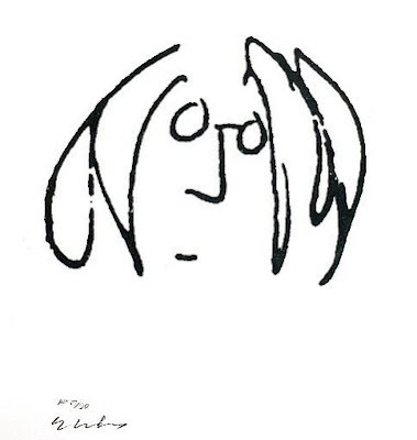
Meanwhile, I'm working on curatorial projects outside of our normal show schedule. I work with the crew that runs the Mythic Worlds convention, creating a space within the convention that embodies the heart of what the convention is all about. I'm working on travelling our fantastic "Lennon" show, which just ended this early June but needs to be seen by many more eyes. I have a few more irons in the fire I can't really speak about yet, but will take a good chunk of my energy.
Then there's my home life, which is just as busy. Family weddings are coming up, house needs to be repainted, backyard has a couple of projects, and I have a couple of trips to plan. House is always in need of cleaning and organizing, and our two Boxers need entertainment and exercising on a regular basis. I have my own artwork to make, mostly consisting of finishing a few large paintings which will likely take me all summer. I have an overdue commission to complete.
In all, I know that the hard work won't end. Really, it never does, especially when you're working in a field you really enjoy. It turns into an attitude thing: "hard work" doesn't mean "tiring, unsatisfying work". My plate is full, but it's full of yummy, juicy stuff. Granted there are some dull, not-fun things on my list, but when you run your own business there's always a few things you're not crazy about doing. You just dig in and do them. I am rewarded with a sprinkling of easy days, and when I get one, trust me, I really savor it. But it's okay if the entire summer isn't one big fun vacation. I'd probably get bored anyway. There's only so much sitting around I can do before I get antsy.
Let's be clear: the Lennon show wasn't really my idea.
In fact, it was already in creation long before I showed up to the scene; several sculptors, headed by Tim Bruckner, collaborated together to create small pieces of resin-cast sculptures of John Lennon, with the intention of travelling overseas with May Pang on her newest book tour through Germany in 2014. Problems arose, however, and the promoter decided it was not prudent to ship and travel the pieces, and the sculpture segment of the tour was dead in the water.
May Pang and John Lennon
Then I got the call... would Krab Jab Studio be interested in hosting a John Lennon-inspired art show?
Had these artists been anyone else, I would have passed. However, I had worked with Tim in the past, and all the sculptors involved were professionals in the toy and entertainment industry, many of which did sculpts for things like DC Comics, Marvel Comics, or character development for movies (like Michael Defeo, for example). They fulfilled the "publication and entertainment industry" spectrum of the gallery (check!), and all of them were top notch in their field of expertise. Tim Bruckner, a master of sculpture in his own right, also had a strong backstory: he knew May Pang personally, had met John Lennon "back in the day", and had designed Ringo Starr's first solo album cover (among other things). This wasn't an average, run-of-the-mill tribute show being handed to me.
Designs for Ringo Starr and Harry Nilsson, Tim Bruckner
Problem was, as I explained to Tim in our initial conversation, I had already booked out my 2015 year. He kept insisting I double check my calendar, and I finally did....huh! Seemed, strangely, I had booked out everything but skipped the month of May. Would he want that month? He enthusiastically said yes, and went back to his fellow sculptors to give them the news.
I was still on the fence about the show, though. Tribute shows are hard sells to the public, quite frankly. As I wrapped up work for that particular day, I decided that if a John Lennon song came on the radio when I hopped into my car, I would do it. Knowing that was kind of a crap shot, I locked up and jumped into the car to head home.
Imagine was playing on the radio. Done deal.
Imagine, #1/6 resin cast lamp, Tim Bruckner
Tim recruited four more artists (Conny Valentina, Dan Chudzinski and duo Colin and Kristine Poole). We lost a couple folks due to obligation issues, but we had a nice solid eight: Tim, Dan, Conny, Colin and Kristine, Michael Defeo, Alfred Paredes, and James Shoop. Tim looped May Pang in, since she was a photographer and took many photos of John during her time with him (coined "The Lost Weekend"). May was somewhat stand offish, however. After a month of spotty emails, she finally called me to explain to me why she wasn't really feeling the show - she just didn't think she was a good fit. She did the "it's not you, it's me" explanation, which I took fairly well, I think. Except... well, except we actually enjoyed talking. And talking. And talking... and over an hour later, she sighed and said, "okay, I'll send you nine photographs. Nine was his number, you know."
I made a tiny squee inside. You see, I actually am a John Lennon fan, I actually knew exactly who May was (I even read her book when it came out in 1983 - a bit inappropriate for a 13 year old, but hey, we all grow up sometime). I was just a wee bit star struck.
The whole group had about 6 months to prepare, and the original four sculptors of James, Alfred, Michael and Tim decided to do another piece for the show. All the artists decided to pick their favorite John Lennon song and run with that, and the results were quite marvelous.
Tomorrow Never Knows, Michael Defeo
Yellow Submarine, Dan Chudzinski
Nothing is Real, Alfred Paredes
The Girl with Kaleidoscope Eyes, Colin and Kristine Poole
Two Spirits (verso), James Shoop
A Little Help from My Friends, Conny Valentina
I Am the Walrus, Tim Bruckner
May did come through and sent her nine photographs which depicted a very intimate portrayal of John Lennon. Most of the photos were taken in their house in LA.
Here's Looking at You, May Pang
It was no surprise at this point that the number nine would pop up yet again, as the show was to open May 9th. For the opening, both Tim and May were able to attend, which was an absolute treat to our visitors. We were hooked up with Steve Roseta and the members of the local Beatles tribute band, Apple Jam, and graciously Josh Jones and Rick Lovrovich provided an acoustical set to the evening, which included all the songs that inspired the show. They even got to serenade May to both "#9 Dream" (she provided the original female vocals to the song) and "Surprise, Surprise".
As an addition, we had a memorabilia wall during the opening, which included a set of John's sunglasses (yes, really), a very rare dye transfer print of the Sgt Peppers album cover (only four known in the world - knowing the actual value of it ranged in the six digits, I was sweating all night in fear something might happen to it), a limited edition John Lennon litho, and a lovely Chris Hopkins ink drawing of John.
John Lennon, Chris Hopkins, courtesy Steve Roseta
John Lennon lithograph, courtesy Steve Roseta
Sgt Peppers album cover photo, one of four, courtesy Allen Goldblatt
Need I say that the show was a hit with our opening night visitors? Many of them hung out for nearly the whole night to listen to the music, take in the artwork, and chat with both Tim and May. Interactive pieces were played with: Alfred's little strawberries are magnetic and move about the green field, and James' bronze tree revolves on a base, revealing a sleepy eyed John on one side and a smiling awake John on another. People squealed with delight over the lamp within Tim's "Imagine" piece, which displayed logos of various John songs inside the spectacles. Sunlight played off the gold on Colin and Kristine's figure as the sun set lazily, glinting through our windows and throwing long, sad shadows on the concrete floor, reminding us all that the night would eventually have to end.
It's almost a shame that this show is only a month long - with it being the 50th Anniversary of the Beatles first performance and John's 75th birthday, it's like we have this super secret awesome show of fantastic art and photography devoted to one of the most charismatic songwriters of the 20th century. Those who've seen the show have been wowed and hushed and moved all at once, and to stand among the work, in the room, with "In My Life" quietly playing in the background, you feel a deep, nostalgic ache inside, and you know someone really special was taken away from us way too soon. These artists beautifully narrate the soul of his music with humor, sadness, curiosity, and most of all, respect.
So this last weekend I attended the Spectrum Fantastic Art Live convention, which is a medium sized convention located in Kansas City, MO. It's about three years old and spun off of the juried annual Spectrum Fantastic Art. I went mostly to lurk around, see some kickass art, meet amazing artists and run a workshop called "Demystifying the Gallery World".
The gallery world isn't all that mystical, really. It's just a business. Granted, it can be volatile, unpredictable, baffling, but it's really not all that much from any other business in that there are protocols, contracts, agreements and mostly, relationships. Curator, artist, visitor, collector...
I only had 30 minutes to cover an insane amount of information, so I tried my best to hit as many points as I could, using simple slide shows to bullet point. As requested, I am going to list my slides here, in all their glory.
(Want to See the Actual Workshop? Here it is!)
Developing a show with your curator
Working relationship (key word: “relationship”)
— Size of show, size of work(s)
— Theme or series
— Curatorial vision
— Communication! Keep it open, even if there is a problem
Contracted obligations for You and the Curator/Gallery
— Written agreement stating terms of show
Average retail gallery commission: 40 – 50%
Exclusivity clause?
Artist usually pays for shipping fees to/from gallery
Amendments must be discussed, written and signed by both parties to be legal
— Insurance, security, damage or loss of art
Marketing obligations, if any
Managing the workload between Confirmation and Delivery
Last month is devoted to press releases, marketing, documentation, cataloging
Unlike some publishing scenarios, gallery openings are “hard openings”!
Preparing to document your work: Photography, Statement
WIP photos are great, especially for a unique process
Traditional 2D: good lighting, clear images, true colors (ie, get a professional if you need to)
3D: multiple angles, detail shots (video is okay too)
DON’T: use cell phone, photograph a piece under glass (unless you have no choice), or overly Photoshop an image
OIL, metallics, and high gloss mediums: mindful of reflections, blowout, moiré
Statement: reflect the theme of your piece/show. Be heartfelt (visitors can read through bullcrap). First person statements are best. If your medium is unique, you may need to explain what it is or why you used it
DON’T: copy from your website
Framing and Display
DO:
Ask about weight/size limitations, as well as wall hanging options and amount of wall space
Wall space: ask about “usable” vs “total” wall space
3D: Ask about types displays, surface type, if pieces can be anchored, height of displays
Use framing material that is archival – if it is not, alert gallery owner
Ask about frame options on the gallery end, if you are shipping. Many galleries have inhouse framing or framers that are economical.
DON’T:
Use chipped, broken, scuffed frames
Use glass if you plan to ship the piece. Use plexi or matte acrylic
Use a cheap frame (that clearly looks cheap) for expensive pieces. Customers complain about that.
Use odd colors for mats or frames, they’re a harder sell. Use neutral colors such as white, cream, gray, black, beige.
Use toothed hardware. It tends to come out. Use appropriate d-rings, wire.
Shipping your work
When packing 2D art:
Ask gallery if they have packing material requirements (such as “no peanuts”)
Don’t pack glass if at all possible
Use foamcore, hardboard or rigid material to protect front of piece
Don’t tape anything directly to your piece or frame
Paper corners, bubble wrap, paper on corners
Don’t overpack a box. Also, make sure pieces will not shift in transit
Don’t use packing tubes for original art
Insure your package!
When packing 3D art:
Crate larger pieces (have one built or buy one at places like Uline)
“box in a box”, floated
Complex pieces should be broken down into smaller pieces, boxed individually
Send along assembly information and images, including a repair kit
Insure your package!
Pricing your work
Materials, time as a factor (adjust if you tend to work slow or fast)
Take in consideration commission rate
Market value: speak to gallery owner about local retail averages vs global averages (example: Grand Rapids may have a higher price point than Anchorage for art)
You may need to make some adjustment to your pricing (or piece choice) to reflect your new locale
Don’t undervalue: your humble $300 price point for your detailed oil painting may say “there is something wrong with this” or “I’m not worth collecting” to a collector. You don’t want to brand yourself as naïve or desperate.
Don’t flux: Collectors get very frustrated with art that’s re-priced from show to show or month to month. If a piece isn’t moving at a current price, RESEARCH WHY. The results may surprise you. Never drop a price…
Market your show: marketing, opening receptions, and review
Branding the Art and Show: from Objects to Experience
Social media/Mailing Lists/Preview Lists
Press Releases and advertising
Opening and Closing receptions
Press and collector parties
Reviews: the Good, the Bad, and the Nothing At All